 63/100
Bisto ‘Aah Nights’: how a 1919 catchphrase became a night of the week
McCann Erickson took the Bisto Kids' hundred-year-old 'Aah' and turned it into a booked appointment. A review of the Bisto advert that sold an occasion, not gravy.
The greatest print campaign ever made, and the case for it gets stronger every year the rest of us fail to be that honest.
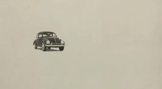
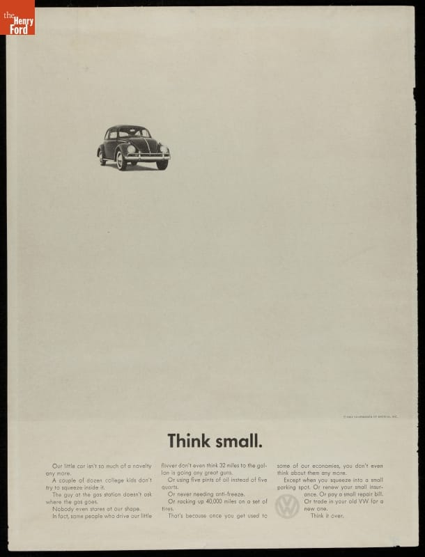
A black-and-white photograph of a car, shrunk to the size of a postage stamp and parked in the top left corner of an otherwise empty page. Beneath it, two words and a full stop: Think small. In 1959, while Detroit was selling chrome by the yard, Doyle Dane Bernbach put Volkswagen’s odd little Beetle on the page and told Americans it was small, slow and plain. Ad Age named it the number one campaign of the 20th century in 1999, ahead of Coca-Cola and the Marlboro Man, and nothing made since has made that ranking look wrong.
The one-line take: Volkswagen Think Small is the moment advertising stopped shouting and started talking, and every honest, self-aware brand voice you admire today is descended from it.
Picture the American car market in 1959. Ford, General Motors and Chrysler sold size, tailfins and an annual model change, and they photographed their cars in front of country clubs with a woman in gloves standing beside the bonnet. Bigger was better, new was better, and a car was a statement about your wallet.
Volkswagen had the opposite product. The Beetle was a rear-engined, air-cooled saloon designed in 1930s Germany, and it carried its origins with it. Art director George Lois, then at DDB, later described it bluntly as a “Nazi car” when the account arrived, according to Mental Floss. Bill Bernbach reportedly framed the account to his staff as a one-year public audition in the hope of landing something bigger.
The man who hired DDB was Carl Hahn, who took charge of Volkswagen of America in 1959 and ran it until 1964. Fortune’s obituary records that Hahn toured the country in a VW bus, standardised the dealer service and, crucially, chose a small creative agency over Madison Avenue’s establishment. The budget was tiny. Volkswagen’s 1960 advertising spend was $800,000, a figure contemporary accounts put well below the Detroit norm, which is one reason DDB’s black-and-white pages made economic as well as creative sense.
One correction to the legend is worth making. VW was not failing in America when DDB arrived. The Conversation notes sales had climbed from around 2,000 cars in 1953 to more than 150,000 in 1958, on word of mouth and a growing cult. The brief was not rescue: it was to turn a cult into a mainstream choice without pretending the car was something it was not.
Bernbach’s creative principle was simple and, in 1959, close to heresy: tell the truth about the product and make the truth interesting. He had already paired art directors and copywriters as working teams rather than a chain of command, a structure that the rest of the industry copied over the following decade. On Volkswagen the pairing was Helmut Krone, who had joined DDB in 1954 and owned a Beetle before the account came in, and Julian Koenig, the first copywriter assigned to it.
Think Small takes the single complaint every American had about the Beetle and prints it as the headline. The car is not enlarged to look impressive; it is shrunk. The copy then walks through what small actually means for the owner in short, dry sentences: the running costs, the parking, the insurance, and the fact that nobody stares at the shape any more. The tone is a neighbour telling you what he likes about his car, not a salesman.
Lemon, published in 1960, goes further. The photograph is a Beetle that looks perfect. The headline calls it a lemon. The copy explains: “This Volkswagen missed the boat. The chrome strip on the glove compartment is blemished and must be replaced,” and it names the inspector, Kurt Kroner, who rejected it.
It closes with the line that Volkswagen would trade on for years, “We pluck the lemons; you get the plums,” as Adweek recounted when reviewing the brand’s history. The Volkswagen Group’s own archive still lists the ad as a chronicle entry for 1960.
The insult-as-headline was reportedly proposed by DDB’s Rita Selden. The trick is that a quality claim every manufacturer made (“rigorous inspection”) becomes believable the moment it is attached to a rejected car and a named employee. Nobody had done that with a car before, and very few have done it as cleanly since.
Count the conventions the campaign discards: no colour, no illustration when most car ads were still painted, no models, no scenery, no lifestyle, no slogan and a subdued logo. What is left is a photograph of the product on a white background, treated like an object in a museum rather than a prop in a fantasy.
Then there is the self-deprecation. American car advertising in 1959 did not admit weakness, let alone lead with it. Krone’s defence of the approach, quoted in The Conversation, is the best five-word theory of honest advertising ever written: “A little admission gains a great acceptance.” Concede the small thing and the reader trusts you on the big thing.
The bravery was commercial as well as creative. Hahn was spending a fraction of Detroit’s money on a foreign car with a difficult history, and he approved work that made fun of his own product. Most clients in that position ask for the car to look bigger.
The layout is the part designers still study. Krone gave roughly the top two-thirds of the page to the photograph and its white surround, then a headline, then three narrow columns of body copy. That grid ran, with minor variations, for well over a decade, so every VW ad was recognisable as a VW ad before you read a word.
Typography was plain sans-serif at a time when car advertising leaned on script and serif display faces. The headline ends with a full stop, an editorial convention rather than an advertising one, which quietly tells the reader this is a statement and not a shout. Krone also left widows and orphans in the body copy, the small typographic untidiness that a magazine sub-editor would have cleaned up, because it made the text read as written rather than designed.
Koenig’s writing is the other half. The sentences are short, declarative and specific, and the car is called VW rather than Volkswagen, which made a German product sound friendly and American. Koenig left DDB in 1960 to co-found Papert Koenig Lois with Fred Papert and George Lois, and Bob Levenson rewrote the Think Small copy for the 1960 rerun. That handover matters: the voice survived a change of writer, which is the test of whether a brand voice exists at all.
Krone himself stayed at DDB for more than thirty years, went on to art direct Avis’s “We try harder” and was inducted into both the Art Directors Hall of Fame and The One Club’s Creative Hall of Fame. His VW pages sit in the collections of MoMA and the Smithsonian. The Henry Ford museum holds a 1962 printing of Think Small in its automotive advertising collection.
Be careful with the numbers, because the internet is full of invented ones. What can be stood up is this. Starch readership research at the time found the VW ads scored higher than the editorial content around them. And American sales kept climbing through the DDB years, from more than 150,000 in 1958 to a record of around 570,000 Volkswagens in 1970, the vast majority of them Beetles.
Honesty demands the caveat: sales were rising before DDB, and no controlled test separated the advertising from the product, the dealer network and the price. What the campaign demonstrably did was give a foreign oddity a personality that mainstream America could like, on a budget that should not have bought any awareness at all.
The cultural verdict is less arguable. In 1999 Ad Age’s Advertising Century panel ranked the Volkswagen work first among the hundred campaigns of the 20th century. Koenig was inducted into The One Club’s Creative Hall of Fame in 1966, while the work was still running. In 2016 Joe Marcantonio’s short documentary Remember Those Great Volkswagen Ads? gathered George Lois, Sir John Hegarty, Sir Alan Parker and Dave Trott to explain why they still talk about it.
Think Small is usually filed under “the creative revolution”, and the label is fair. It established that a copywriter and an art director working as a pair produce better work than a copy department handing text to a layout department. It established that a product truth, stated plainly, beats a product fantasy, stated loudly. And it proved that a consistent visual system lets a brand spend less because every ad reinforces the last one.
Its influence is easiest to see in its descendants. Krone’s Avis work, which admitted the brand was number two, is the same move in a different category. Every “honest” challenger brand since, from the airline that tells you the seats are small to the software company that says its product is not for everyone, is running Bernbach’s play. It is hard to look at Apple’s 1997 “Think different” and not hear the echo.
The harder lesson is the one most brands skip. DDB’s Volkswagen work stayed in the same voice and the same grid from 1959 into the 1970s, across dozens of writers and hundreds of executions. The campaign is great partly because it was allowed to be boringly consistent for a long time. Very few clients today would sign off a decade of the same layout.
Volkswagen Think Small scores 10 for idea, 10 for craft, 9 for bravery, 8 for effectiveness and 10 for legs. The idea is a single reversible thought a stranger can repeat sixty-seven years later. The craft, from Krone’s grid to Koenig’s sentences, is still the template for a print ad that wants to be read. Bravery loses a point only because the client was a small foreign importer with less to lose than Ford. Effectiveness is marked down because the sales evidence is directional rather than isolated. On legs, no campaign has done better: it ran in one voice for more than a decade, and the industry has been running it ever since. This is the greatest print campaign ever made, and the case for it gets stronger every year the rest of us fail to be that honest.

He plans, buys and reviews advertising for a living, and helps score campaigns on the site against the same five Crown Score criteria alongside other authors and contributors.
63/100McCann Erickson took the Bisto Kids' hundred-year-old 'Aah' and turned it into a booked appointment. A review of the Bisto advert that sold an occasion, not gravy.
 73/100
One photograph of Heinz Beanz on two biscuits, no paid media, a day of brand replies and a debate in the House of Commons. Frank PR's Beanz on Bix, reviewed.
 79/100
BMP DDB gave the jokes to Rowan Atkinson and the product line to his assistant. Seventeen films, nine British Arrows, an IPA Gold and a cinema franchise later, a full review.