Brisbane 2032 Olympic emblems launched after organisers leaked them on their own YouTube channel
Brisbane 2032's cockatoo emblems, by VML, Landor, Black Card and Verian, were officially launched on Monday, three days after an explainer video thumbnail gave them away.
2 min read
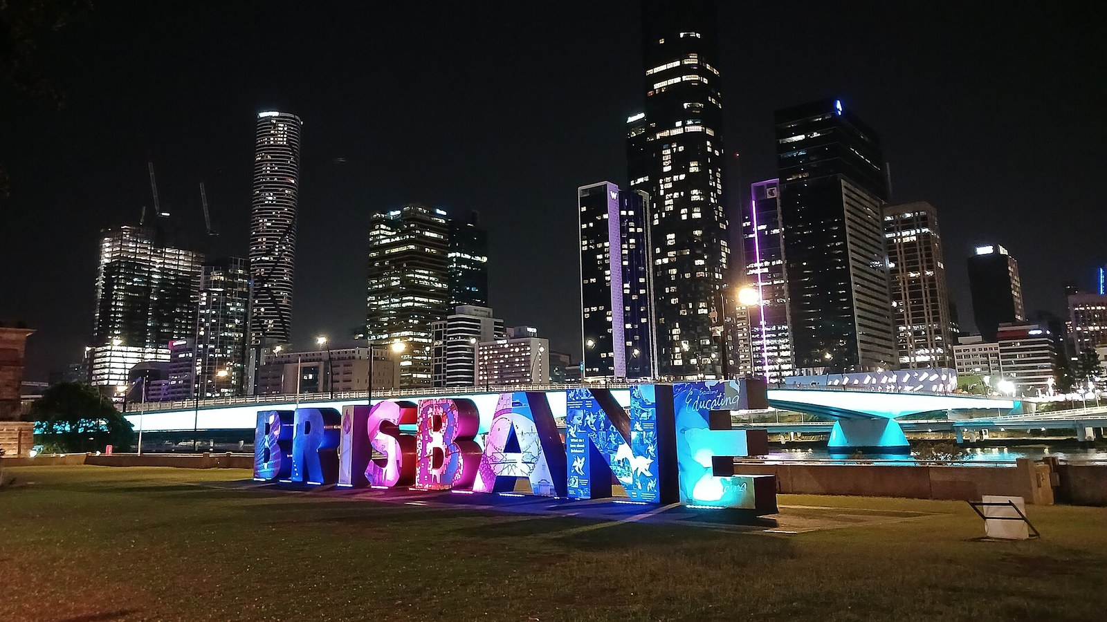
Photo: King Eliot, CC0, via Wikimedia Commons.
The emblems for the Brisbane 2032 Olympic and Paralympic Games were officially launched on Monday, three days after the organisers leaked them by accident on their own YouTube channel. Both are built around cockatoos: a pink cockatoo for the Olympics and a sulphur-crested cockatoo for the Paralympics, each forming a crest that outlines the shape of Queensland with its eye on Brisbane.
What the Brisbane 2032 emblems show
Each emblem is made of six interlocking pieces, and the crest doubles as a living torch carrying the Olympic or Paralympic flame. The organisers say the designs draw on First Nations meaning, with cockatoos seen as messengers “carrying cultural meaning and linking people to place, story and ceremony”. The identity was created by a group of WPP agencies, VML, Landor, Black Card and Verian, which won the pitch last year, according to Creative Review.
How the emblems leaked
Athletes had been revealing pieces of the emblems around Queensland for a week, building to a launch on Monday. On Friday night the full design appeared in the preview image of an explainer video that went up early on the Games’ official YouTube channel, and screenshots spread across social media within hours. Officials held a hastily arranged press conference over the weekend, where chief marketing officer Brent Hill put a brave face on it: “The publicity has been incredible.”
Why it matters
Olympic emblems are almost always met with derision on launch day. London 2012’s was compared to everything from a broken swastika to Lisa Simpson, and still became one of the most recognisable Games identities of its era. Brisbane has chosen the opposite of London’s provocation, a warm, literal and very local design, which will make it easier to love and harder to remember.
The leak is the more interesting marketing lesson. A planned week-long reveal was undone by a thumbnail, and the organisers chose to laugh along rather than fight it. It is the same instinct that has made the best brand identities this year, like Newcastle United’s new crest, about the people who will wear them rather than the people who designed them. VML’s role is also a fitting send-off for its departing boss, Jon Cook.
Max Rottier
He plans, buys and reviews advertising for a living, and helps score campaigns on the site against the same five Crown Score criteria alongside other authors and contributors.
Opening the Festival of Marketing, Hegarty set out a simple triangle for judging creative work, blamed KPIs for a sea of sameness, and admitted he once had no idea if a famous Audi ad would work.
The IPA Bellwether Report finds a net 14.3 per cent of marketers raised budgets in Q3 2026, with main media at a nine-year high, though the 2027 adspend forecast was cut.
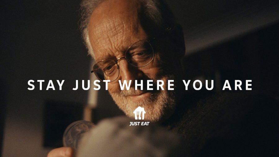
After Snoop Dogg, Katy Perry and Craig David, Just Eat's new global platform by VCCP is built on ordinary moments, led by a grandfather meeting his grandchild.
The Ad Ranking letter
One verdict a week. No press releases.
The campaign worth studying, the ASA ruling worth knowing, and the number nobody else reported. Every Thursday.
One email a week. Unsubscribe in one click. We never share your address.