Newcastle United unveils its first new crest since 1988, chosen by 27,348 fans
Newcastle United's new crest keeps the castle, seahorses and lion but redraws them for screens. Fans chose it with 64.8 per cent of the vote, and it reaches the kits in 2027/28.
2 min read
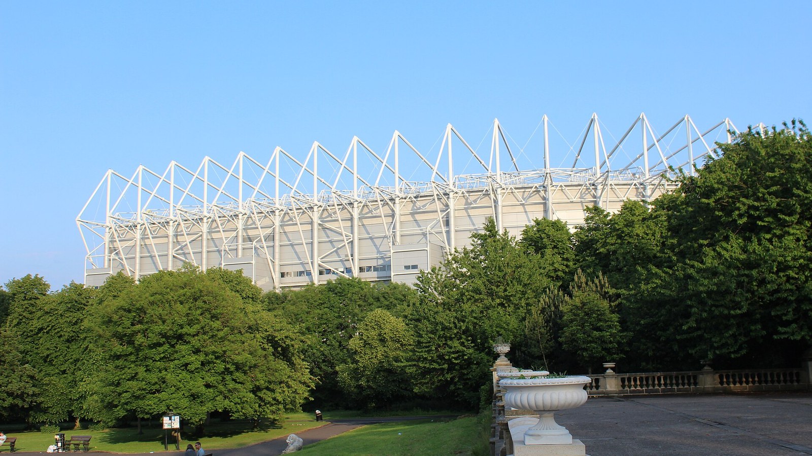
Photo: Chabe01, CC BY-SA 4.0, via Wikimedia Commons.
Newcastle United has unveiled its first new crest since 1988. The design, chosen by supporters in a vote, keeps the castle, the seahorses and the lion from the old badge but redraws them for screens, and the club says it will be used from today across digital and broadcast channels and on the kits from the 2027/28 season.
What the new Newcastle crest looks like
It is an evolution, not a replacement. The twin seahorses and central shield remain, the castle has cleaner lines, and the golden lion holding a St George’s pennant on top is, in Creative Review’s words, sharper and more stately. The crest still derives from the city’s coat of arms, and it comes with bespoke typography and a secondary mark, according to Creative Review.
How the fans chose it
The club spent two years consulting supporters through focus groups and workshops before putting three versions to a vote in August. A total of 27,348 season ticket holders and members took part in the independently run poll, and the winning design took 64.8 per cent of first-choice votes. Players will first wear it at the final home game of this season, against Crystal Palace in May.
Chief executive David Hopkinson said supporters “told us plainly: protect what we have, keep the elements we love and do not start again”. The club’s explanation for changing at all is practical: the detail of a 38-year-old design gets lost on phone screens and in broadcast graphics.
Why it matters
Football crests are the hardest rebrand in marketing because the customers own them emotionally. Leeds United learned how fast it goes wrong in 2018, when a new badge launched without proper consultation was dropped within days. Newcastle did the opposite: two years of asking, three cautious options, and a vote that gives fans ownership of the result.
The design is safe, and that is the point. A crest that has to work on a 40-pixel app icon and a stadium wall needs fewer fine details, and the commercial ambitions of a club with new owners need something that reproduces cleanly on merchandise worldwide. For another club identity overhaul this year, see Manchester City Women’s rebrand, and for the year’s best, our ranking of 2026 rebrands.
Max Rottier
He plans, buys and reviews advertising for a living, and helps score campaigns on the site against the same five Crown Score criteria alongside other authors and contributors.
Opening the Festival of Marketing, Hegarty set out a simple triangle for judging creative work, blamed KPIs for a sea of sameness, and admitted he once had no idea if a famous Audi ad would work.
The IPA Bellwether Report finds a net 14.3 per cent of marketers raised budgets in Q3 2026, with main media at a nine-year high, though the 2027 adspend forecast was cut.
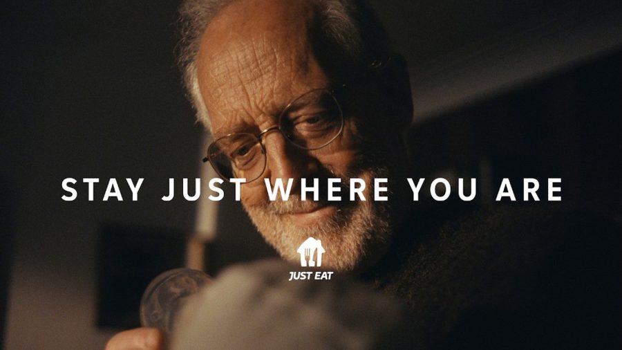
After Snoop Dogg, Katy Perry and Craig David, Just Eat's new global platform by VCCP is built on ordinary moments, led by a grandfather meeting his grandchild.
The Ad Ranking letter
One verdict a week. No press releases.
The campaign worth studying, the ASA ruling worth knowing, and the number nobody else reported. Every Thursday.
One email a week. Unsubscribe in one click. We never share your address.