Fulham FC’s new identity is written into Craven Cottage, with a typeface drawn from the stadium
Music and F37's Written into the Cottage identity gives Fulham a bespoke typeface taken from the lettering inside Craven Cottage, ahead of the club's 150th anniversary.
2 min read
Fulham FC, Written into the Cottage, Music, 2026.
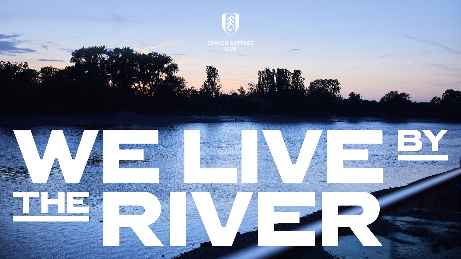
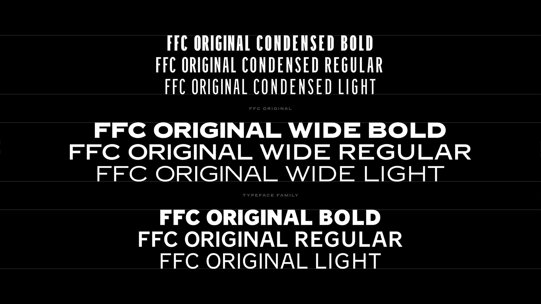
Fulham FC has unveiled a new brand identity built on the lettering painted inside Craven Cottage, its home on the Thames since 1896. Called Written into the Cottage, it was created by the agency Music with the type foundry F37, and centres on a bespoke typeface, FFC Original, drawn from the old “The Fulham Football Club” mural at the ground, as Creative Review reported.
FFC Original typeface by F37 with Music, 2026.
What changes for Fulham
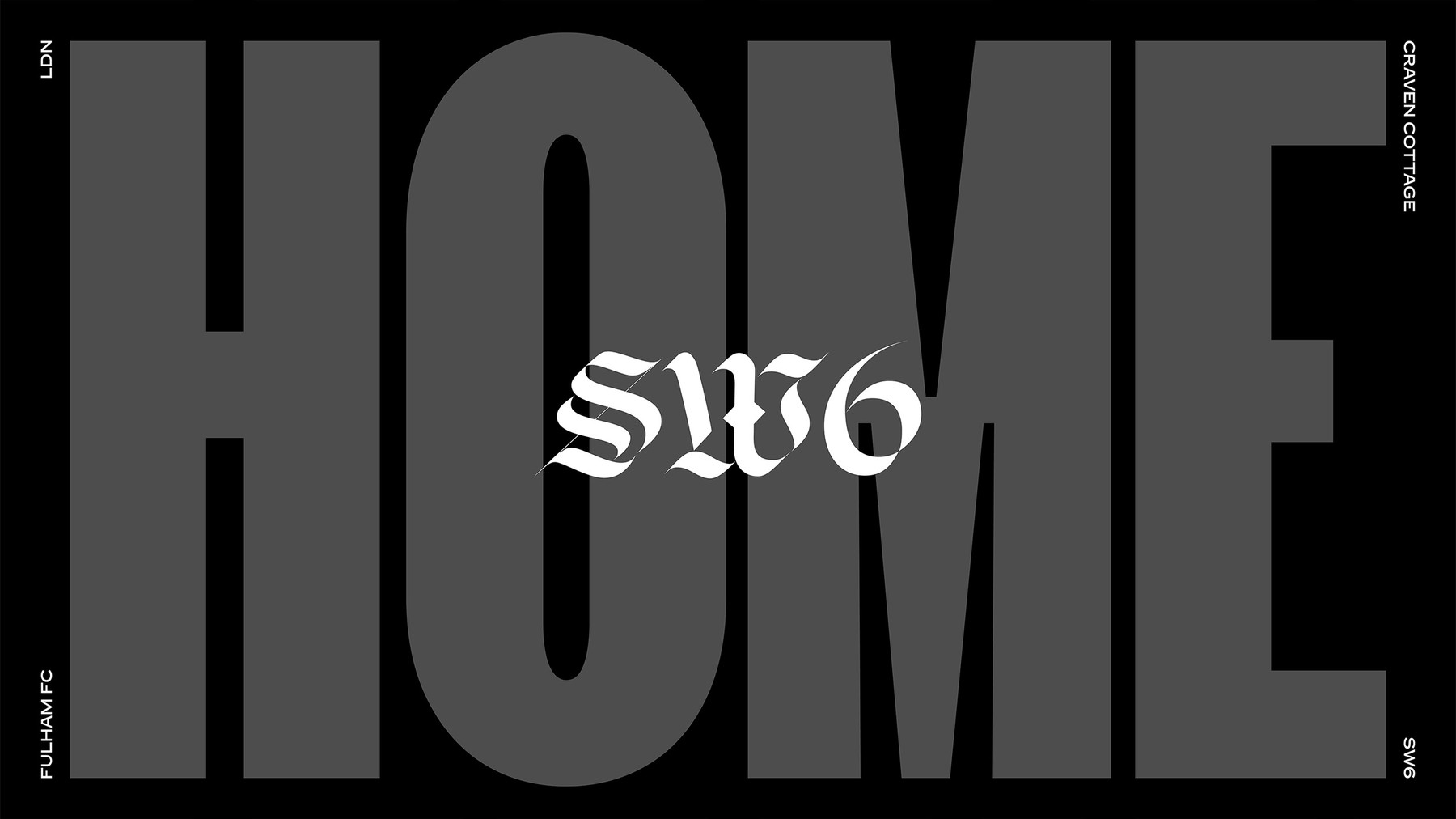
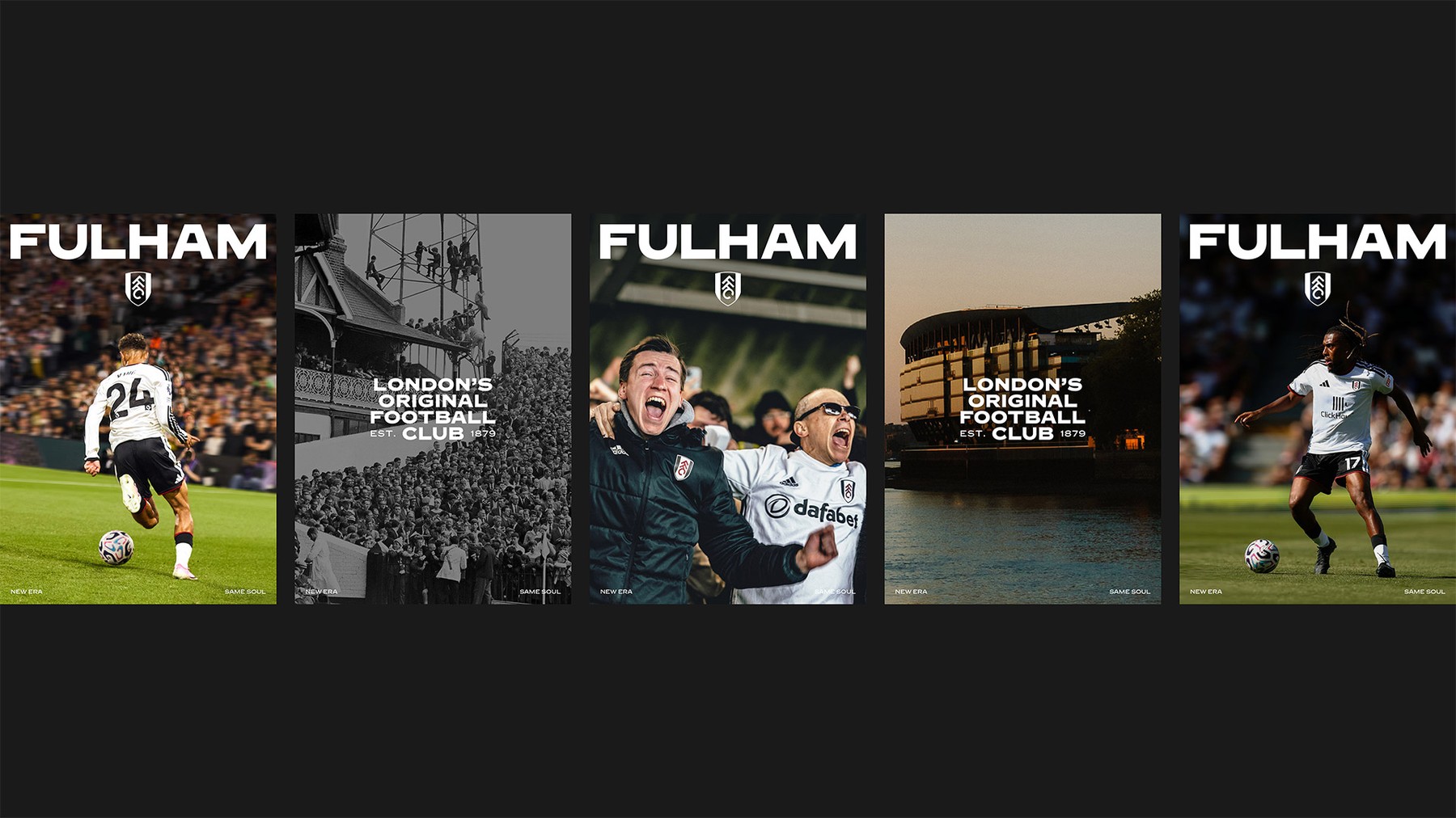
Unlike Newcastle’s, this is not a crest change. The new identity is a system of type, layout and language that will run across social media, retail, campaigns and match days, with variations on the line “London’s original football club” running through it. It arrives as the club approaches its 150th anniversary.
Fulham FC, Written into the Cottage, Music, 2026.Fulham FC, Written into the Cottage, Music, 2026.
Jack Burrows, Fulham’s marketing director, said the brand is “rooted in the true original character of Fulham and Craven Cottage”. Dave Simpson, chief executive and executive creative director at Music, said the lettering at the stadium “had all the character we were looking for”, and that “the heritage is what creates the modern identity”.
Why it matters
Football clubs are discovering that their grounds are their best brand assets. Craven Cottage, with its listed Johnny Haynes Stand and the cottage in the corner, is one of the most characterful stadiums in England, and drawing the type from its walls gives Fulham something no other club can copy. It is a smarter route than redrawing the badge, because it adds a voice without touching the thing fans are most attached to.
It is the second Premier League identity in a fortnight, after Newcastle United’s fan-voted crest, and both point the same way: evolve rather than replace, and let the club’s own history do the design. For the year’s other big identity changes, see our ranking of 2026 rebrands.
Max Rottier
He plans, buys and reviews advertising for a living, and helps score campaigns on the site against the same five Crown Score criteria alongside other authors and contributors.
Opening the Festival of Marketing, Hegarty set out a simple triangle for judging creative work, blamed KPIs for a sea of sameness, and admitted he once had no idea if a famous Audi ad would work.
The IPA Bellwether Report finds a net 14.3 per cent of marketers raised budgets in Q3 2026, with main media at a nine-year high, though the 2027 adspend forecast was cut.
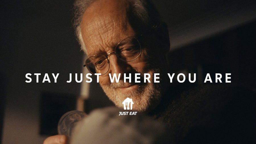
After Snoop Dogg, Katy Perry and Craig David, Just Eat's new global platform by VCCP is built on ordinary moments, led by a grandfather meeting his grandchild.
The Ad Ranking letter
One verdict a week. No press releases.
The campaign worth studying, the ASA ruling worth knowing, and the number nobody else reported. Every Thursday.
One email a week. Unsubscribe in one click. We never share your address.