Manchester City Women get their own brand, built with Nomad Studio
Manchester City Women launched a distinct visual identity on 3 September under a platform called It Takes a City, developed with sports branding specialists Nomad Studio.
2 min read
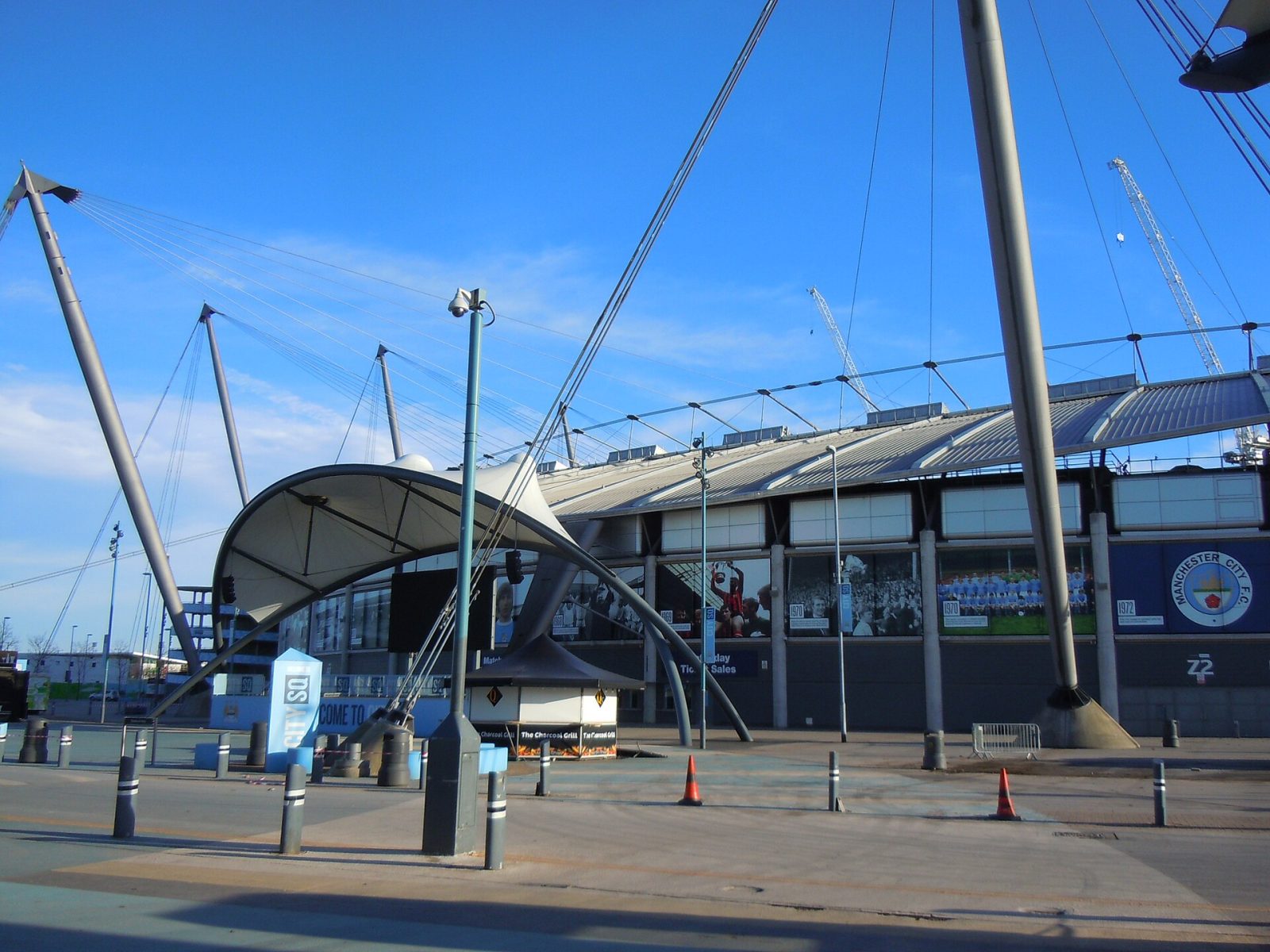
The Etihad Campus, Manchester. Photo: Hassocks5489, CC0, via Wikimedia Commons.
Manchester City Women unveiled a visual identity of their own on 3 September, under a new brand platform called It Takes a City. It arrives months after the team completed the club’s first ever Women’s Super League and FA Cup double.
Most women’s sides in English football wear their men’s team’s branding unchanged. It is cheap, consistent and largely forgettable. City has kept the fundamentals, the crest and the sky blue, and added the parts that were missing: an MCW monogram built for kit, lifestyle and fan-facing work, plus a secondary palette of green, pink, purple, electric blue and yellow to give the system some heat.
The work was made with Nomad Studio, which is a sensible choice. Nomad handled the Premier League’s identity refresh in 2023 and the rebrand of women’s football’s top flight, so it has spent several years working out how far a football property can move without letting go of what it already owns. The MCW job is the same trick at club scale: change the expression, leave the badge alone.
Marketing Week, which spoke to the club’s senior marketer about the thinking, reports that the identity is meant to help retention among supporters and carry the team further into culture beyond matchday. That is the honest commercial case. City Women sell to an audience that is younger, newer to the sport and far less locked in than the men’s crowd, and a brand with its own merchandise language is easier to sell to that audience than a scaled-down copy of somebody else’s.
For marketers the interesting part is the constraint, not the palette. Women’s football is now big enough that its clubs get real brand budgets rather than hand-me-downs, which makes the design question genuinely difficult. Go too far and you cut the cord to the parent brand and the equity that comes with it. Do nothing and you stay a suffix on somebody else’s name. City has picked the middle, and is betting the middle is where the money is.
Max Rottier
He plans, buys and reviews advertising for a living, and helps score campaigns on the site against the same five Crown Score criteria alongside other authors and contributors.
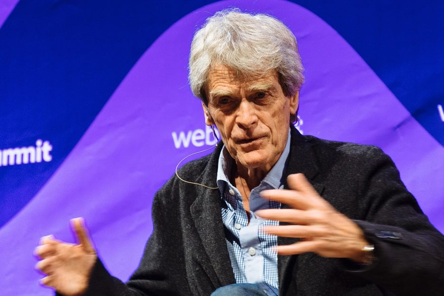
Opening the Festival of Marketing, Hegarty set out a simple triangle for judging creative work, blamed KPIs for a sea of sameness, and admitted he once had no idea if a famous Audi ad would work.
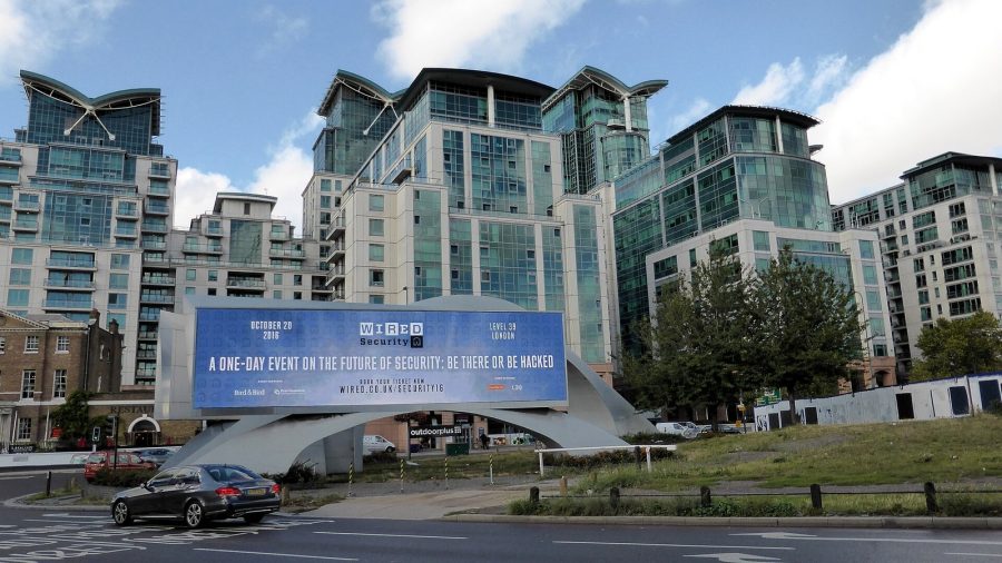
The IPA Bellwether Report finds a net 14.3 per cent of marketers raised budgets in Q3 2026, with main media at a nine-year high, though the 2027 adspend forecast was cut.
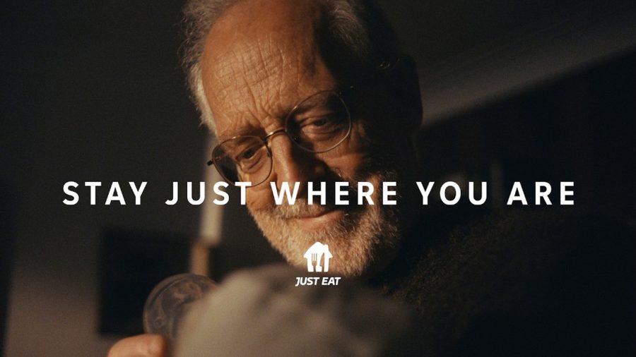
After Snoop Dogg, Katy Perry and Craig David, Just Eat's new global platform by VCCP is built on ordinary moments, led by a grandfather meeting his grandchild.
The Ad Ranking letter
One verdict a week. No press releases.
The campaign worth studying, the ASA ruling worth knowing, and the number nobody else reported. Every Thursday.
One email a week. Unsubscribe in one click. We never share your address.