Arsenal unveils Rocastle, a bespoke gothic typeface named after David Rocastle
Designed by David Rudnick with Léa Bruneau, Arsenal's new blackletter typeface draws on the club's wordmark and crest and honours the 1989 and 1991 title winner.
2 min read
Arsenal, Rocastle typeface, David Rudnick with Léa Bruneau, 2026.
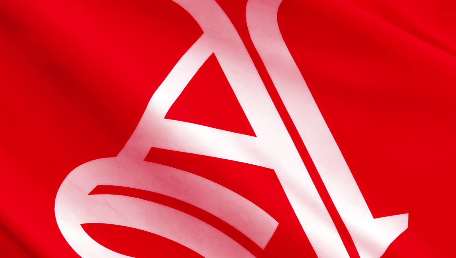
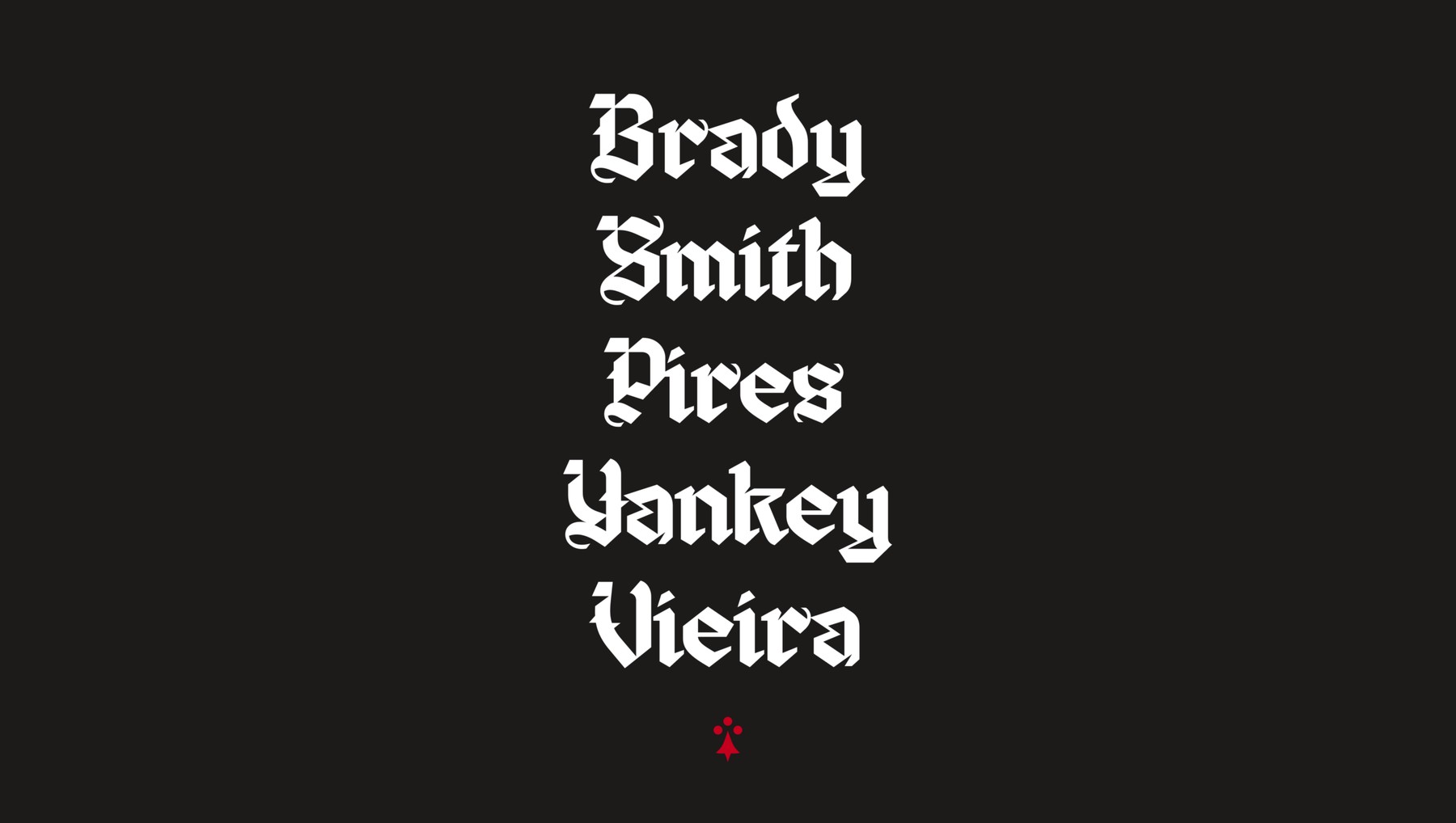
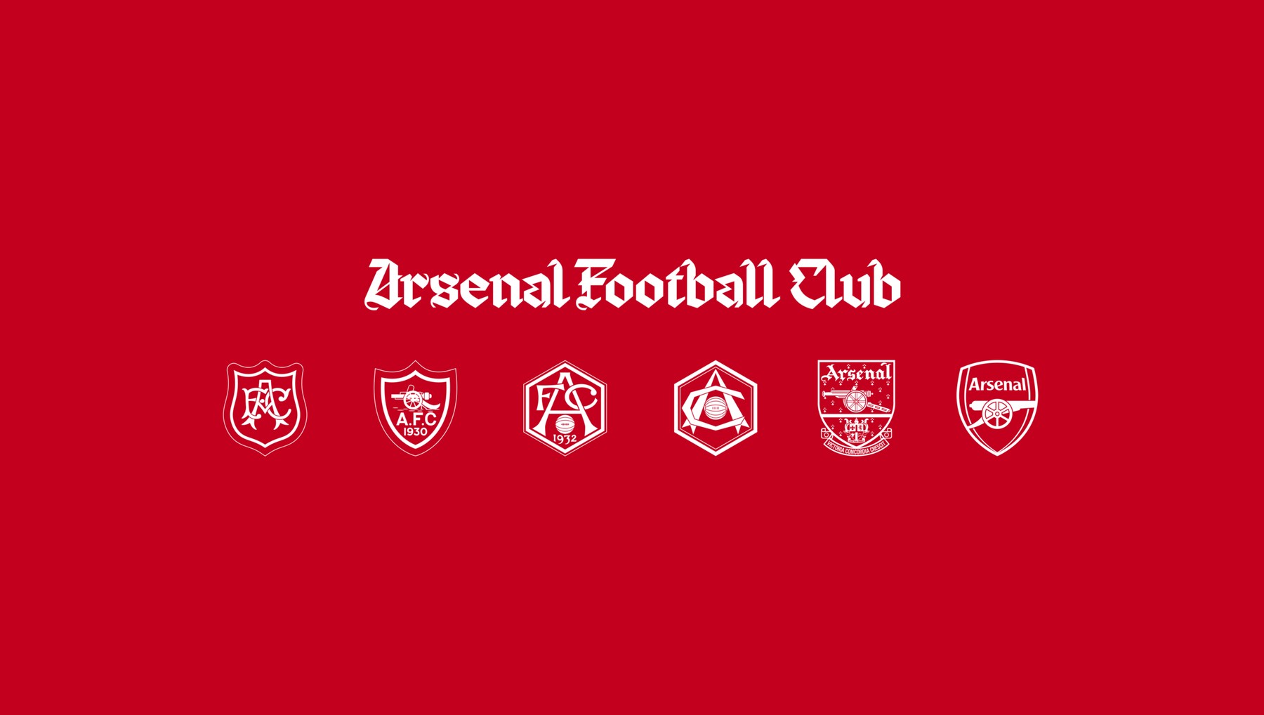
Arsenal has unveiled Rocastle, a bespoke gothic typeface named after David Rocastle, the midfielder who helped the club win the First Division in 1989 and 1991. Designed over several years by David Rudnick with Léa Bruneau, it launches alongside The Capital, a standalone “A” that will sit next to the existing crest, as Creative Review reported.
What the Arsenal typeface looks like
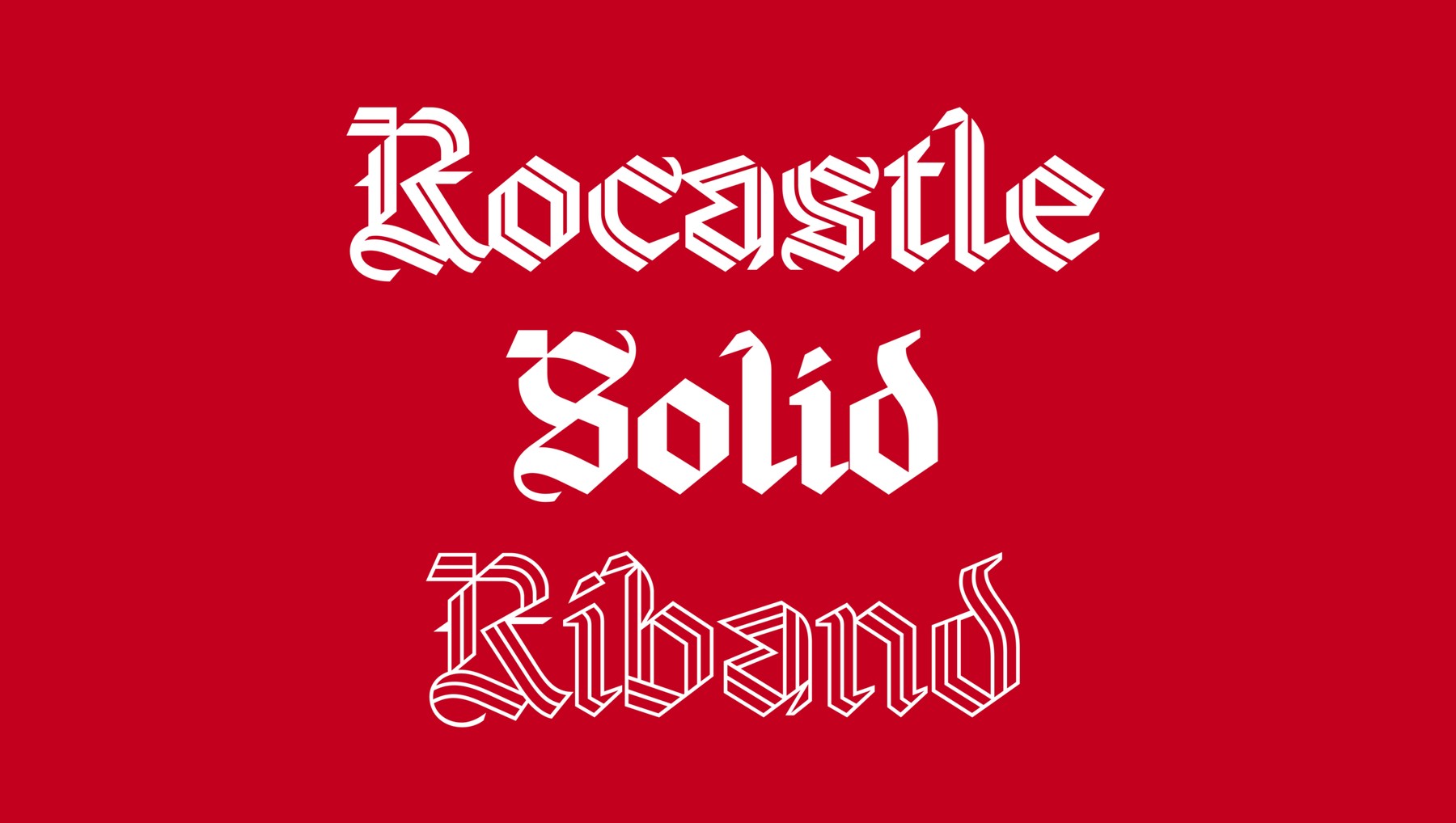
Rocastle draws on two things the club already owns: the gothic lettering of its wordmark and the Victoria Concordia Crescit motto on its crest. The family comes in several styles, including a solid weight and a ribbon-like outline. The hero weight has a line running through every letter, which the club says represents the bond between supporters in London and around the world, and nods to two journeys: Arsenal’s move from Woolwich to north London, and Rocastle’s own from south London to Highbury.
Arsenal, Rocastle typeface, David Rudnick with Léa Bruneau, 2026.Arsenal, Rocastle typeface, David Rudnick with Léa Bruneau, 2026.
Johnnie Campbell, who leads Arsenal’s in-house creative studio, said the club wanted “to capture the best of Arsenal, taking inspiration from Rocky and everything he stood for”. Rudnick said: “Nothing spoke more to me about the enduring values of the club than Rocky.”
Arsenal, Rocastle typeface, David Rudnick with Léa Bruneau, 2026.
Why it matters
This is the third big football identity in a fortnight, after Newcastle’s fan-voted crest and Fulham’s Craven Cottage typeface, and all three have chosen to dig into their own history rather than modernise away from it. Arsenal’s is the boldest, a blackletter face in an era when most sports brands have gone for clean sans serifs.
The reason clubs are commissioning typefaces now is commercial. Arsenal says it wants more creative freedom across culture, fashion, music and art, which means merchandise, collaborations and content where a crest alone is too formal. Naming the face after a fan favourite who died in 2001 is a clever piece of insurance, because it is much harder to dislike a font called Rocastle.
Max Rottier
He plans, buys and reviews advertising for a living, and helps score campaigns on the site against the same five Crown Score criteria alongside other authors and contributors.
Opening the Festival of Marketing, Hegarty set out a simple triangle for judging creative work, blamed KPIs for a sea of sameness, and admitted he once had no idea if a famous Audi ad would work.
The IPA Bellwether Report finds a net 14.3 per cent of marketers raised budgets in Q3 2026, with main media at a nine-year high, though the 2027 adspend forecast was cut.
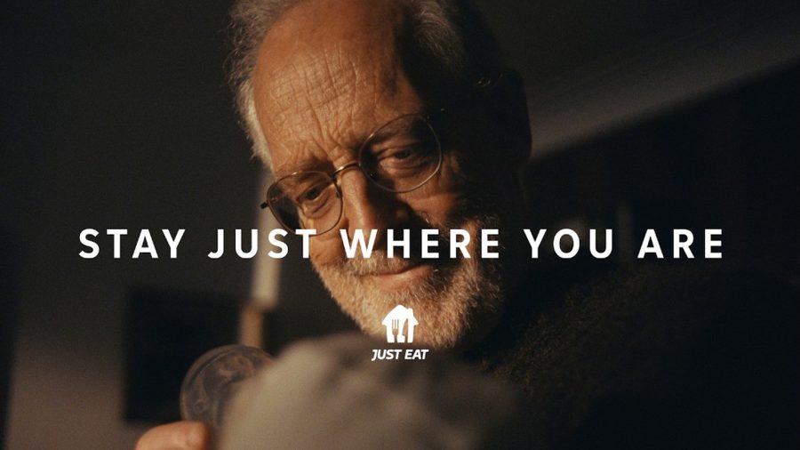
After Snoop Dogg, Katy Perry and Craig David, Just Eat's new global platform by VCCP is built on ordinary moments, led by a grandfather meeting his grandchild.
The Ad Ranking letter
One verdict a week. No press releases.
The campaign worth studying, the ASA ruling worth knowing, and the number nobody else reported. Every Thursday.
One email a week. Unsubscribe in one click. We never share your address.