The best Halloween adverts ever made, ranked
Twelve Halloween adverts ranked on idea, craft, bravery and evidence, from Burger King's Scary Clown Night and Tesco's Spookermarket to Heinz Tomato Blood, with verified credits.
From Krone's Beetle to Saatchi's dole queue: thirty advertising posters and print ads ranked by idea, craft, bravery, results and legs.
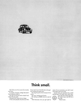
Helmut Krone left two thirds of the page empty. A small photograph of a Beetle sat in the top left corner, a two-word headline sat underneath, and American car advertising never recovered. That 1959 layout is the reason lists like this exist, and the reason the best advertising posters and print ads still get pinned to agency walls sixty years on.
This ranking covers thirty print advertisement examples: magazine adverts, newspaper ads, posters and billboards. We scored each on five things. Is there a single thought a stranger could repeat? Does the craft (headline, photography, typography, white space) do the work?
Did the brand risk anything, is there evidence it moved a number, and does it still get copied? Credits are given where we could verify them. Each entry ends with a link to where you can see the ad.
The newest entry inverts one of Britain’s most familiar pieces of public print: the memorial bench. For the charity’s 65th anniversary, Saatchi & Saatchi installed 65 red benches in parks and high streets across the UK in January 2026, each dedicated to someone alive because of BHF-funded research. Print and posters carried the survivor portraits.
Crown verdict: proof that a poster can still be a monument. See it at Famous Campaigns.
A magazine advert for a cot, made by Åkestam Holst in Stockholm for Ikea Sweden and run in the women’s title Amelia. Urinate on it, the page said. The paper carried a pregnancy test strip, and a positive result revealed a discounted price for the cot. It is a stunt, but only a magazine advert could have done it.
Crown verdict: the last time a print ad made the whole industry laugh out loud. See Ikea’s print archive at Ads of the World.
Donald Gilles, an executive at JWT London, wrote the line in 1957 and it went to air in 1958. It has since carried every poster the brand has run in Britain, including the bench executions that turned street furniture into a chocolate finger. The line is the asset. Everything else is a variation.
Crown verdict: the most durable line in British confectionery. Read more at Wikipedia.
Salvador Dalí drew the Chupa Chups daisy logo in 1969 and insisted it sit on top of the lollipop rather than on the side, so it would always be seen whole. The launch slogan, “Es redondo y dura mucho” (it is round and lasts a long time), did the rest. It is graphic advertising reproduced billions of times without a media budget.
Crown verdict: the best advertising posters are sometimes wrappers. Read more at Wikipedia.
A bottle built from stacked tomato slices, the keystone label wrapped around it, and a line that turns the picture into an argument about ingredients. The McCann Erickson London poster needs no copy beyond the headline because the image is the proof. It has been copied so often that students now produce it by reflex.
Crown verdict: product truth, shown rather than said. See Heinz’s print archive at Ads of the World.
An aerial photograph of a forest shaped like a pair of lungs, one side felled to the roots, with a small WWF panda in the corner. TBWAParis made it, and ad schools have reproduced it ever since. The idea rests on a single visual metaphor that needs no translation.
Crown verdict: the visual metaphor every cause ad still chases. See WWF’s print archive at Ads of the World.
Jung von Matt in Hamburg reduced famous cartoon characters to a handful of stacked bricks: four yellow bricks and a blue one for the Simpsons, coloured bandanas for the Ninja Turtles. Nothing else on the page but a small logo and the word Imagine. The reader completes the picture, and the act of completing it is the product benefit.
Crown verdict: the ad that lets the reader do the building. See Lego’s print archive at Ads of the World.
A man in striped pyjamas sits astride a giant Bovril jar, bobbing on the open sea, unbothered. The 1920 poster, credited to the illustrator H. H. Harris, is one of the earliest double meanings in British advertising. An earlier poster had paired the product with Pope Leo XIII as “The Two Infallible Powers”; this one is better because the joke is warmer.
Crown verdict: a pun that has outlived every fashion in poster art. Read more at Wikipedia.
TBWAParis drew the chain’s six biggest products as flat pictograms and ran them as posters across France without a logo. Nobody misread them. In 2017 the same agency photographed only empty packaging and a few crumbs, again with no words, in work credited to executive creative directors Benjamin Marchal and Faustin Claverie, art director Margaux Chalard and photographer Florent Tanet.
Crown verdict: the confidence to leave the name off. See it at Creative Review.
Two Holstein cows on a billboard in Atlanta, one on the other’s back, painting a misspelt plea for self-preservation. The Richards Group created the cows in 1995 and kept the account for 22 years, which tells you how well they sold chicken. The deliberately bad spelling makes the cows characters rather than a device.
Crown verdict: the best use of a billboard as a punchline. Read more at Wikipedia.
The line came out of an argument. At BMP DDB, creative Andy McLeod said he hated the product and his partner Richard Flintham said he loved it. The campaign launched in October 1996 and has since given the language a phrase, the “Marmite effect”, for anything that divides opinion. As print, the jar became the whole ad.
Crown verdict: the rare strategy that became a dictionary entry. Read more at Wikipedia.
FCO Univas glued a yellow Ford Cortina to a billboard on London’s Cromwell Road with the line “It also sticks handles to teapots”. Weeks later a red Cortina was stacked on top: “The tension mounts”. When both cars came down, the empty board read “How did we pull it off?”. It is a three-act play performed by a poster.
Crown verdict: the ambient stunt every special build still copies. Read more at Wikipedia.
A newspaper launched in 1986 with three words that flattered the reader and dared them at the same time. Saatchi & Saatchi made the campaign in Paul Arden’s era, and Arden counted The Independent among the accounts that defined his time there. The typography did the talking: black serif, white space, no picture. It sold a paper by selling an identity.
Crown verdict: the shortest brand manifesto ever printed. Read more at Wikipedia.
Adam&eveDDB’s Christmas 2013 campaign photographed the gifts you would actually give if you had blown the budget on yourself: a bag of elastic bands, a sink plug, a handful of paperclips, all in the store’s own livery. The objects sat on the page like luxury goods and the line confessed everything. The work took the Press Grand Prix at Cannes in 2014.
Crown verdict: the most honest Christmas ad of the decade, and the funniest. See it at Ads of the World.
Around 2.45 million copies were printed between 23 August and 3 September 1939, held back for use after air raids, and mostly pulped in 1940 for paper salvage. Almost nobody saw it. In 2000 Stuart Manley found one in a box of second-hand books at Barter Books in Alnwick, framed it, and the shop started selling copies. It went on to become the most reproduced piece of British typography of the century.
Crown verdict: the poster that failed in 1939 and conquered seventy years later. Read more at Wikipedia.
Bartle Bogle Hegarty’s first ad, for Levi’s black jeans, showed a black sheep walking the opposite way to a flock of white ones. It was hard to get approved because every jeans ad of the time had people in it. The line became the agency’s motto and the sheep became its logo. As a poster it is an argument for contrarian strategy delivered in one image.
Crown verdict: an agency philosophy in a single frame. Read more at Wikipedia.
Dan Wieden coined the line at Wieden+Kennedy in 1988, adapting the last words of the condemned murderer Gary Gilmore. The first spot aired on 1 July 1988, but the print, athletes in black and white with three words in Futura, made it a brand system. Nike’s share of the US sports shoe market went from 18 per cent to 43 per cent over the following decade and worldwide sales rose from 877 million dollars to 9.2 billion.
Crown verdict: the line that turned a shoe company into a philosophy. Read more at Wikipedia.
TBWAChiatDay’s Los Angeles office, under Lee Clow, made the posters: black and white portraits of Einstein, Gandhi, Picasso and Hendrix with a small rainbow logo and two words. Art director Craig Tanimoto chose “different” over “differently”; Rob Siltanen and Ken Segall wrote the script that became the copy. Five poster sets went out between 1997 and 1998, and the campaign won an Emmy in 1998 and the Grand Effie in 2000.
Crown verdict: the poster series that rebuilt a company’s self-belief. Read more at Wikipedia.
Oliviero Toscani was Benetton’s art director from 1982 to 2000 and ran news photography on a knitwear budget: the AIDS activist David Kirby on his deathbed in 1992, and a newborn still attached by the cord that drew around 650 complaints to the ASA. Guinness World Records named it the most controversial campaign in 2000. In November 2011 the Unhate campaign showed world leaders kissing; the Vatican objected to the image of Pope Benedict XVI and it was withdrawn, and the work still took the Press Grand Prix at Cannes in 2012.
Crown verdict: the bravest print ads ever run by a clothing company. Read more at Wikipedia.
Alfred Leete drew Kitchener’s pointing finger for the cover of London Opinion on 5 September 1914, when the magazine sold around 300,000 copies a week. The gaze that follows you across the room was a device borrowed from cigar advertising, and it became the template for recruitment posters everywhere, including James Montgomery Flagg’s Uncle Sam in 1917. Historians argue about how widely the poster was displayed; nobody argues about the image.
Crown verdict: the most copied composition in poster history. Read more at Wikipedia.
Trevor Beattie’s campaign at TBWA put Eva Herzigová on 48-sheets across Britain looking down at her own cleavage, with two words. Urban legend blamed it for car crashes, the Victoria and Albert Museum put it in an exhibition, and it was voted tenth in a poll of posters of the century. It changed what a bra was sold on, from function to attitude, with a joke the model was in on.
Crown verdict: the poster that made a nation slow down. Read more at Wikipedia.
Saatchi & Saatchi, under Charles Saatchi and later Paul Arden, took a Lucio Fontana slashed canvas and turned it into a cigarette brand: purple silk, a single cut, no product, no name. For almost twenty years it was a visual riddle smokers solved in a second, with the health warning as the only copy. The final poster in 2002, before the UK tobacco ad ban, showed an opera singer in split purple silk: the fat lady had sung.
Crown verdict: the purest example of a brand owning a colour. Read more at Wikipedia.
With cigarettes banned from television since 1965, Collett Dickenson Pearce had only posters and print to play with, and made a virtue of it. The gold pack appeared as mousetrap bait, a birdcage, a pyramid in the desert. No people, no words apart from the health warning. The campaign is the high point of British surrealism in advertising and it sold a product that killed its customers, which Paul Belford summarised for Creative Review as “so brilliant, and so deadly”.
Crown verdict: the most beautiful posters ever made for the worst reason. Read more at Wikipedia.
TBWA’s campaign for the Swedish vodka began in 1980, and the 1981 execution “Absolut Perfection”, a bottle with a halo, set the template credited to art director Geoff Hayes and copywriter Graham Turner. The format was two words and a bottle, and it ran for more than 25 years across hundreds of executions, including Andy Warhol’s 1985 painting. The American Marketing Association put Absolut in its Marketing Hall of Fame in 1992 alongside Coca-Cola and Nike.
Crown verdict: the longest running print idea in drinks. Read more at Wikipedia.
John Gilroy joined S. H. Benson in 1925 and spent two decades painting animals, zookeepers and pints for Guinness under lines including “Guinness is good for you”, “Guinness for strength” and, from 1935, “My goodness, my Guinness”. The toucan balancing pints on its beak is the survivor. Dorothy L. Sayers, a Benson copywriter until 1929, is credited with sketching the bird and writing verse for it.
Crown verdict: the most loved animal in British advertising. See Gilroy’s work at Wikipedia.
A man in a cardigan, visibly pregnant, and the line “Would you be more careful if it was you that got pregnant?”. Jeremy Sinclair at Cramer Saatchi wrote it, Alan Brooking photographed it, and it made the name of the Charlotte Street start-up that became Saatchi & Saatchi. D&AD chose it for its fiftieth anniversary archive. One image puts the reader inside someone else’s consequence.
Crown verdict: the public information ad every other one is measured against. See it at Creative Review.
Saatchi & Saatchi copywriter Andrew Rutherford wrote the line and the dole queue was faked: about 20 Young Conservatives were photographed repeatedly and stitched together. Denis Healey accused the Tories of “selling politics like soap powder”. The Conservatives won a 43-seat majority in May 1979 and party treasurer Lord Thorneycroft said the poster won it. Campaign voted it Best Poster of the Century in 1999.
Crown verdict: the most effective political ad Britain has produced. Read more at Wikipedia.
Doyle Dane Bernbach, with Helmut Krone on art and Paula Green on copy, turned second place into a selling point: “When you’re only No. 2, you try harder.” Plain type on a white page admitted the brand was not the biggest. Avis went from a loss to a profit within a year, and the tagline stayed unchanged for fifty years until 2012.
Crown verdict: the invention of underdog advertising, in print. Read more at Wikipedia.
White type on Economist red, and the confession “I never read The Economist. Management trainee. Aged 42.” David Abbott wrote the first executions at Abbott Mead Vickers in 1988 and the campaign ran for decades on wit alone. No pictures, no product, just the reader’s fear of being the person in the headline. It proved that a magazine advert could be twenty feet wide.
Crown verdict: the smartest poster campaign ever aimed at people who think they are smart. See the archive at Ads of the World.
Art director Helmut Krone and copywriter Julian Koenig, under Bill Bernbach at DDB, sold a small German car to a country that wanted big American ones by admitting everything. “Think Small” in 1959 gave the Beetle a corner of the page. “Lemon”, published in Life on 11 April 1960, showed a car that inspector Kurt Kroner had rejected for a blemished chrome strip on the glove box, one of 159 checkpoints. Advertising Age named it the best campaign of the twentieth century in 1999.
Every honest, witty, white-space print ad since is a descendant. Crown verdict: the print advertisement that all other print ads are measured against. See Think Small and Lemon in the Volkswagen Group archive.
We weighted idea and legs above craft and bravery, which is why campaigns that ran for decades (Volkswagen, Avis, The Economist, Absolut) sit above single executions that were brilliant once. Effectiveness counted only where a number could be verified: an election majority, a market share, a profit turned in a year. Where a claim could not be checked we left it out.
We limited the list to work that ran as paid print, posters or billboards, so packaging appears only when it did the job of an advert, as Chupa Chups’ wrapper has since 1969. Disagree? The comments are open, and the Beetle is still in the corner of the page.

He plans, buys and reviews advertising for a living, and helps score campaigns on the site against the same five Crown Score criteria alongside other authors and contributors.
Twelve Halloween adverts ranked on idea, craft, bravery and evidence, from Burger King's Scary Clown Night and Tesco's Spookermarket to Heinz Tomato Blood, with verified credits.
Twenty food adverts ranked on idea, craft, bravery and evidence, from the Gold Blend couple and Coca-Cola's Hilltop to Jaffa Cakes, PG Tips and Maltesers, with verified credits.
Fifteen beer adverts ranked on idea, craft, bravery and evidence, from Heineken's Refreshes the Parts and Carling's Dambusters to Dos Equis and Corona, with verified credits.