
KFC launches Don’t Crack, its own £50,000 game show on YouTube
Mother's Don't Crack puts 30 KFC superfans through four absurd challenges for £50,000 in a 32-minute original game show on KFC's YouTube channel.
A near perfect piece of reactive press, held back from the very top only because the published evidence covers reputation recovery rather than long term sales, and because a crisis ad cannot run twice.
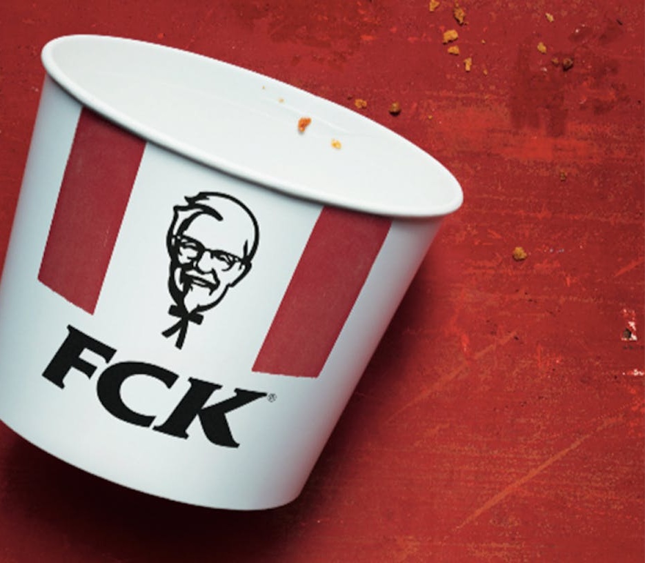
The most quoted apology in modern British advertising is three letters long. On 23 February 2018, KFC ran a full page press ad showing an empty chicken bucket with the brand’s initials rearranged to spell FCK, under a short note of contrition. It ran in the Metro and the Sun, and it was the work of Mother. Our take: the smartest thing about it is not the swear word, it is the restraint around it.
This is a crisis ad that behaves like a brand ad. It carries no offer, no excuse and no logistics explainer. It admits the failure in the first line and then gets out of the way. Almost every corporate apology since has been measured against it, usually unfavourably.
KFC moved its UK distribution contract away from Bidvest Logistics to DHL, working with the specialist food logistics business QSL. DHL took over deliveries on 14 February 2018 and ran the network from a single depot at Rugby, where Bidvest had used six sites. Traffic incidents on the M6 near the depot on the first day of the contract stalled the outbound lorries, and a chilled supply chain with no slack has no way of catching up. Within days the brand had a national shortage of the one ingredient it is named after.
The scale was extraordinary for a chain of that size. On the morning of Monday 19 February, only around 325 of KFC’s 900 UK restaurants were open, and others were trading on cut down menus or short hours. KFC eventually handed distribution for roughly 350 restaurants in the north back to Bidvest to take pressure off Rugby. By the day the ad appeared, about 700 restaurants were serving again.
The reputational damage was already done. The story ran on national news bulletins for the best part of a week. A brand built on abundance had become a punchline about scarcity.
The idea is a single visual pun executed with total commitment. Take the three letters the public already associates with the brand, put them in the wrong order, and let the reader complete the swear word themselves. Nothing is spelled out, so nothing has to be defended. The brand is simultaneously the joke, the apology and the logo.
What makes it work is that the joke is aimed inwards. KFC is not being funny about the situation, it is being funny about itself, which is the only direction of travel an apology can survive. The copy underneath then drops the humour completely and states the position in plain English.
A chicken restaurant without any chicken. It’s not ideal.
KFC press advertisement, February 2018
That is the whole strategy in eleven words. It says the brand understands exactly how absurd it looks, without a single line of supply chain jargon. The rest of the copy apologises to customers, thanks them for bearing with the brand, and points readers to a KFC microsite for restaurant by restaurant updates. The useful information is there, it just is not allowed to lead.
Design credit goes to Jon Gregory at Mother, and the discipline is worth studying. The bucket sits alone on red, shot straight on and empty, with nothing else competing in the frame. There is no headline above it and no strapline below it. The product container is doing the work that a headline usually does.
The typography on the bucket is the existing KFC lettering, not a redraw, which is why the gag reads in under a second. Anything cuter, a distressed font or a cracked logo, would have signalled that the brand was performing regret rather than expressing it. The body copy is set small and left aligned, in sentence case, in a tone closer to a note than a statement.
The media choice is part of the craft rather than a separate decision. The Metro and the Sun reach the commuting, working, price sensitive audience that actually eats at KFC, and they reach them on paper, where an apology reads as a matter of record. A social post would have been free and would have been read as damage control. Buying space to say sorry is the part that costs something, and cost is what makes an apology legible.
It also helps that the piece is legally and editorially bulletproof. No competitor is named, no supplier is blamed in the copy, and the implied obscenity is never printed. A brand can be rude about itself all day without troubling a regulator.
The clearest published evidence comes from brand tracking. YouGov BrandIndex recorded KFC’s Buzz score falling 24 points, from zero to minus 24, at the height of the closures. Among consumers who would consider buying from KFC, Impression fell from 57 to 49 and then recovered to 51. Quality dropped a single point, from 35 to 34.
Two numbers stand out. Purchase consideration held steady at 18 throughout, and Word of Mouth jumped from 11 to 37, which is the signature of a crisis that turned into a conversation. A chain that shut two thirds of its estate for a week came out the other side with its buying intent intact.
The awards followed. The work took a gold Lion in Print and Publishing at Cannes in 2018, plus a gold in PR, and it won two Wood Pencils at D&AD, in Press and Outdoor and in Writing for Advertising. For a piece of press produced under emergency conditions, that is a remarkable haul. It is also, honestly, the softer half of the evidence.
FCK changed the default setting for corporate apologies in the UK. Before it, the template was a legal statement, a passive voice and a promise to review processes. After it, marketing directors started asking their agencies for something with a bit of self awareness, which has produced a decade of imitations that mistake cheek for candour.
The imitators usually miss two things. The first is that KFC had already spent years building a knowing, slightly grubby brand voice, so a rude joke was in character. The second is that the ad only worked because the underlying problem was on the way to being fixed, and the copy could point to a real page with real restaurant updates. Apologise without a fix and you have simply advertised your failure.
It also earned KFC’s UK work a run of confidence that lasted years. The brand went on to make a virtue of its own imperfections in a way that few category leaders risk. Whether it belongs among the best campaigns Britain has produced is a fair argument, and it is a one off rather than a platform.
A near perfect piece of reactive press: one idea, no hedging, and a tone that only a brand with an established voice could have carried, held back from the very top of our scale because the published evidence covers reputation recovery rather than long term sales, and because a crisis ad by definition cannot run twice. Our scoring approach is explained in how we score, and for a study in the same discipline of doing less on the page, see Volkswagen’s Think Small.

He plans, buys and reviews advertising for a living, and helps score campaigns on the site against the same five Crown Score criteria alongside other authors and contributors.
Mother's Don't Crack puts 30 KFC superfans through four absurd challenges for £50,000 in a 32-minute original game show on KFC's YouTube channel.
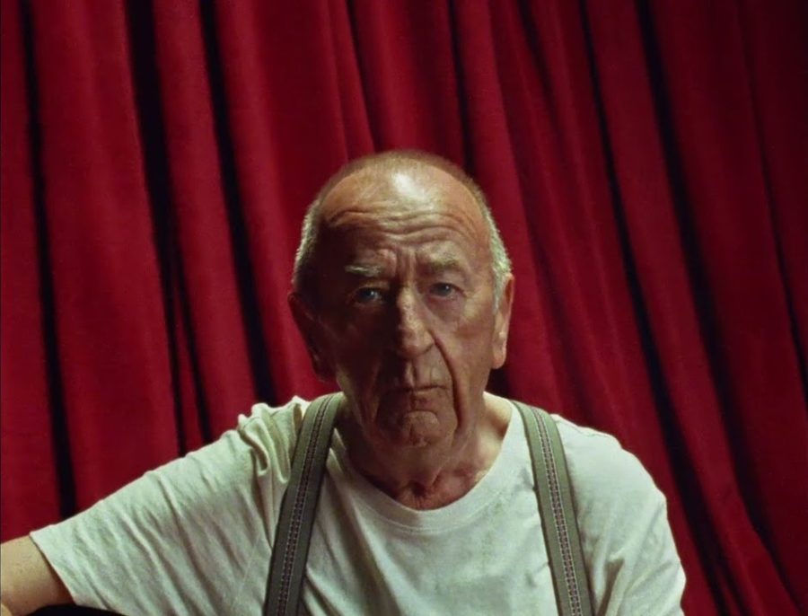
He is Frank Watkinson, a YouTube musician with 1.2 million followers, covering The Cranberries' Linger in a single take for KFC's Tenders and Dips launch.
 63/100
McCann Erickson took the Bisto Kids' hundred-year-old 'Aah' and turned it into a booked appointment. A review of the Bisto advert that sold an occasion, not gravy.