Royal Designers for Industry rebrands at 90, with type by Margaret Calvert
Margaret Calvert and Ian Cartlidge have rebranded the Royal Designers for Industry for its 90th year, with a typographic identity built on New Rail Alphabet and cyan.
2 min read
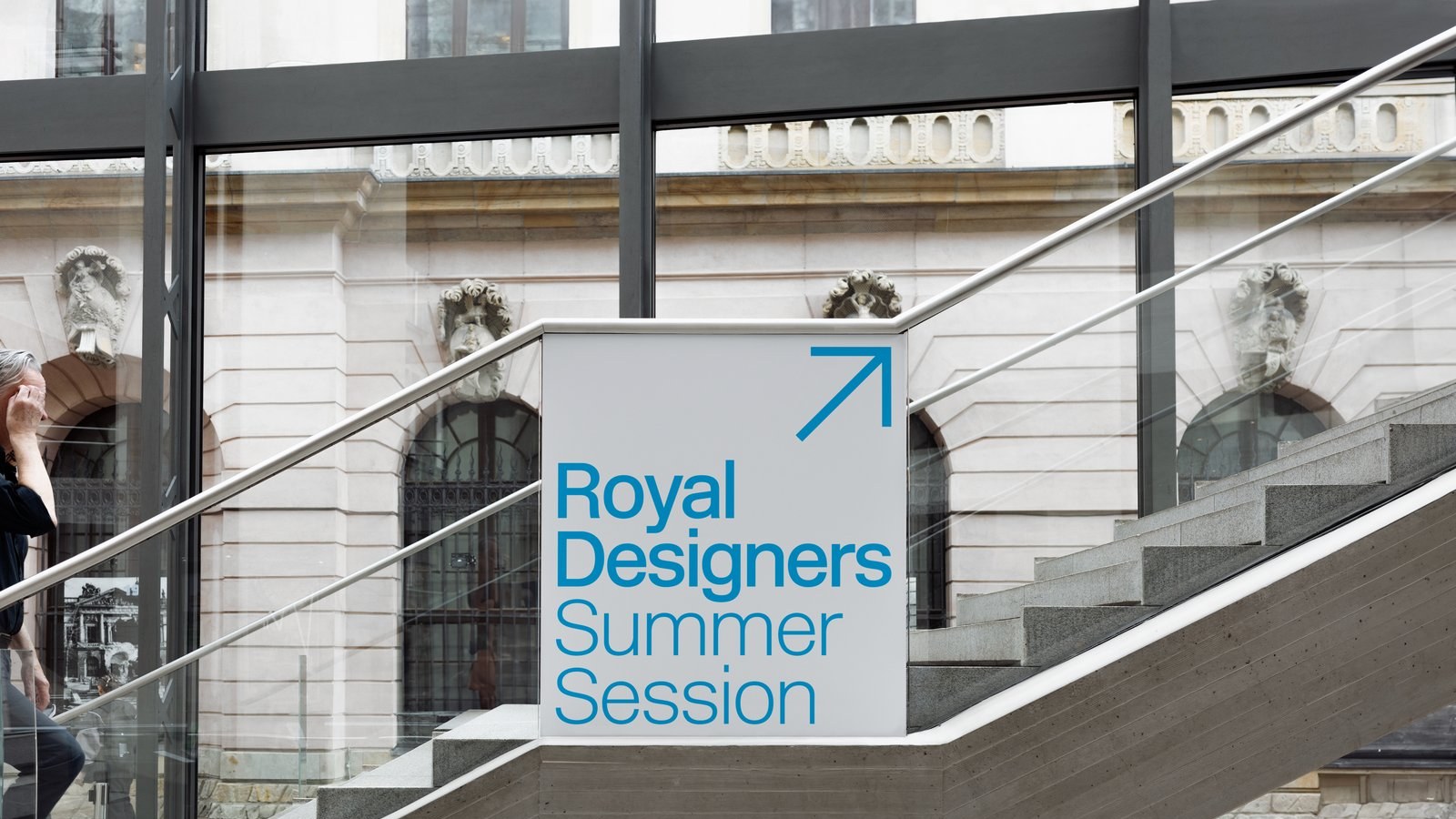
Royal Designers for Industry, 90th anniversary identity, Margaret Calvert and Ian Cartlidge, 2026.
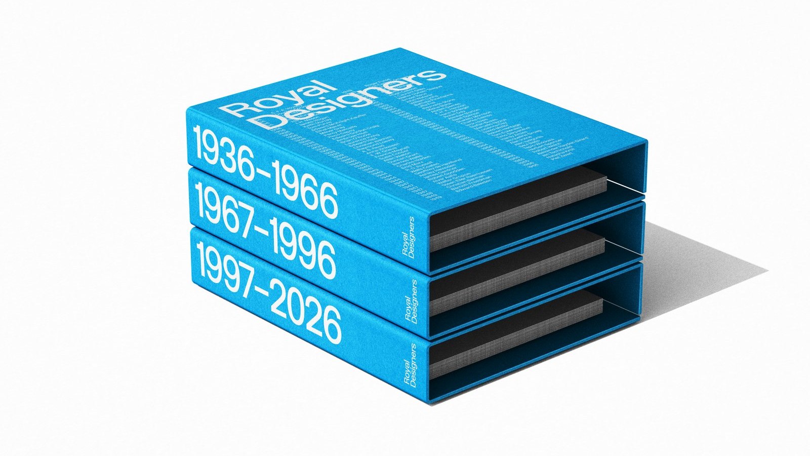
The Royal Designers for Industry (RDI) has a new identity for its 90th anniversary, and it was designed by two of its own members. Margaret Calvert, who also turned 90 this year, and Ian Cartlidge built the rebrand around type rather than a logo, as Creative Review reported. The RDI was set up by the Royal Society of Arts in 1936 and is the UK’s highest honour for designers, with only 200 people able to hold the title at any one time.
A typeface, not a logo
The identity is a flexible framework built on New Rail Alphabet, the typeface Calvert created with Henrik Kubel in 2009. The pair worked on it mostly at Calvert’s kitchen table, stripping out devices and adjusting the letter spacing until it felt settled. Calvert said she tried linking letters together at one point, then dropped the idea because the identity had to last: “The simpler it is, the better.”
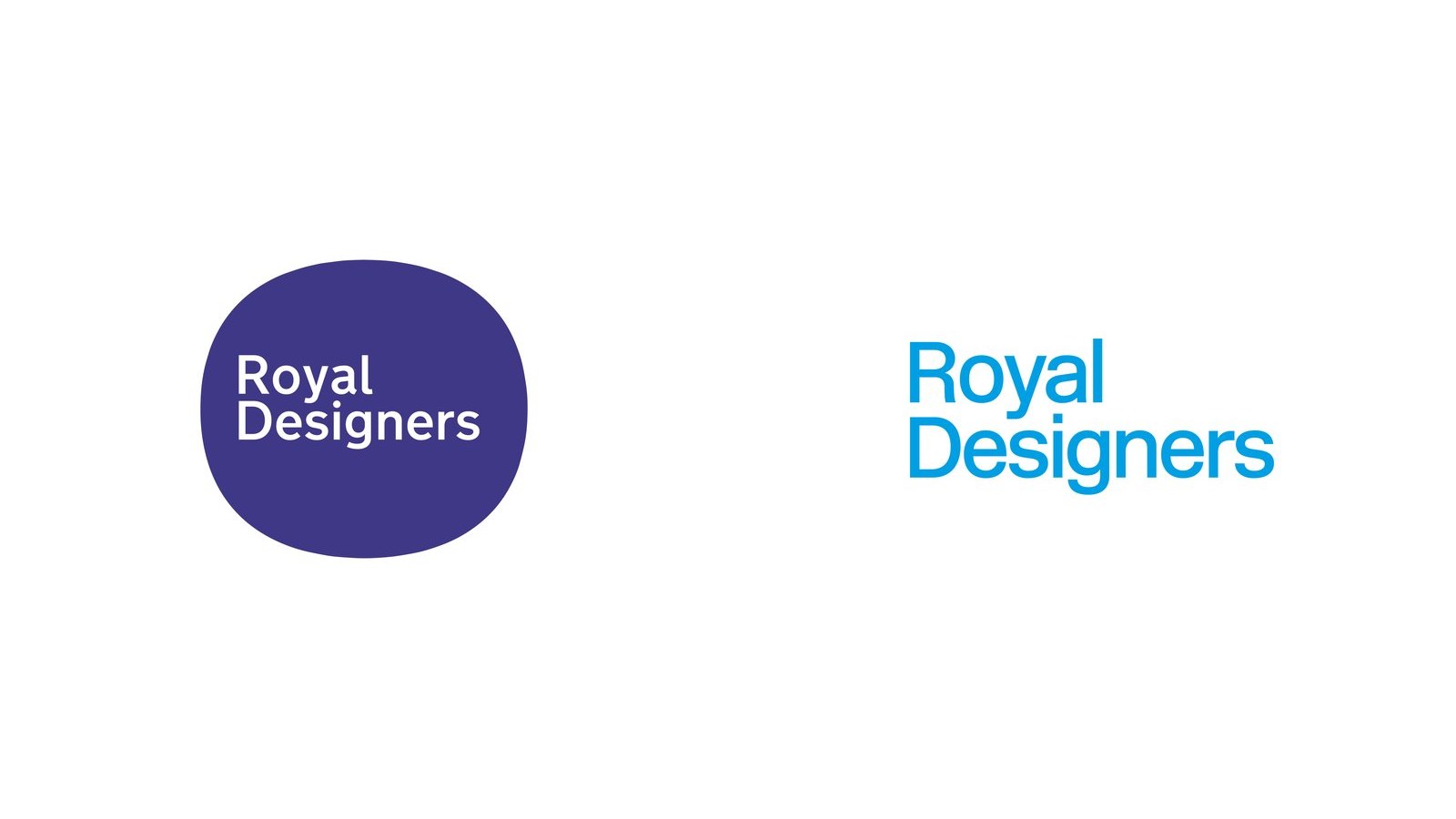
Royal Designers for Industry, identity before and after, Margaret Calvert and Ian Cartlidge, 2026.
The words “Royal Designers” are now split over two lines and set large. When shortened to RDI, the letters sit inside a cyan circle for social media, and the same typeface carries the faculty’s programmes, RDInsights and RDI Sessions. A 90th anniversary mark overlaps a 9 and a 0 in the same blue.
Colour is the other big change. The darker blue of the old mark has gone, replaced by cyan, which Cartlidge says has more contemporary connotations and should make the faculty more visible to students and younger designers. He argued that a body made up of designers suits a typographic system that others can turn up, down and evolve, saying it felt “much more appropriate than another fixed logo”.
Royal Designers for Industry, 90th anniversary identity, Margaret Calvert and Ian Cartlidge, 2026.
Why it matters
Handing the rebrand to two of the faculty’s own members was a statement in itself, and the work shows the confidence of designers who know when to stop. The result is plain in the best sense: a wordmark, one colour and a set of rules, with nothing that will date quickly.
It also fits a year in which type has carried a lot of brand work, from Arsenal’s Rocastle typeface onwards, and it deserves a look alongside our best rebrands of 2026. For institutions trying to look younger without losing their authority, the RDI’s answer is simple: brighten the colour and let the letters do the work.
Max Rottier
He plans, buys and reviews advertising for a living, and helps score campaigns on the site against the same five Crown Score criteria alongside other authors and contributors.
Fallon London fired a quarter of a million rubber balls down San Francisco to sell colour. The shoot, the José González track and the evidence it worked, reviewed.
VCCP's meerkat began as a footnote asking for a cheaper search term than "market". Seventeen years on, Aleksandr Orlov is still the most commercially literate joke in British advertising.
Abbott Mead Vickers BBDO found that men policed the phone bill and women paid the social price. Bob Hoskins fixed it, and the IPA put the payback at £297 million.
The Ad Ranking letter
The ad news that matters, minus the press releases.
The week's biggest stories in one short email every Thursday, with what each one means for your work.
One email a week. Unsubscribe in one click. We never share your address.











 85/100